Structure and usage
Overview
All important evaluations are summarized on the overview page. Depending on the active period at the top, the evaluations adapt to the corresponding timeframe. By default, the current month is evaluated.
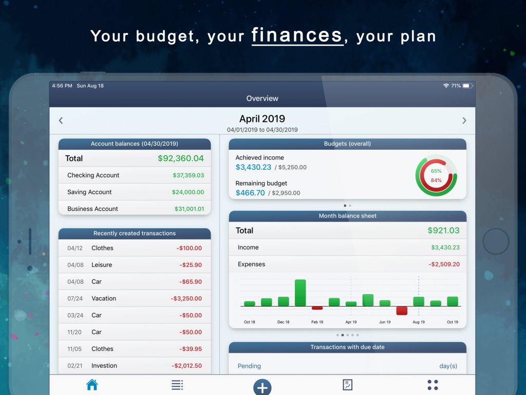
For example, if you have defined a budget for your income or expenditure categories, a budget evaluation is shown above. This comprises two menus: a summarized budget evaluation of all categories (budgets (overall)) and a budget evaluation of the individual categories (budgets (individually)). To switch between the two evaluations, you can scroll the budget block to the left or right.
Below is the block for the account balance chart (account balance (history)) and the monthly, weekly and daily balance sheets as well as the real-time balance sheet. The individual account balances are shown cumulatively in the course of the account balance. So you can easily see how the account balance for each individual account has developed over time. The legend of the colors for the individual line charts can be found in the block of the account balances.
Hint: With the Advanced Settings (under More / Settings / Advanced Settings) you can set exactly which account histories you would like to have displayed and whether the current period should begin in the middle, at the beginning or at the end of the line and bar charts.
If you scroll the block horizontally to the monthly balance, you can see at a glance whether you have made profit or loss in the current period. So all your income and expenses are summed up there. The results of the other periods can be seen in the bar chart below. The weekly and daily balance is evaluated in the same way. The balance sheets are also adjusted there according to the selected period.
In the real-time balance sheet, on the other hand, an average value for income and expenditure is determined, which is calculated on the basis of the transactions already entered. Therefore, you cannot change the period here, since only today’s day is evaluated. If you click on the block of the real-time balance sheet, you can make further settings, for example specifying your weekly working hours, the working days and starting time. This will more accurately determine the value you earn (or lose) per hour and you can see at a glance how much money you have already earned (or lost) today.
If you would like to change the arrangement of the menus or want to hide certain menus in the overview, you can configure the view below the menus. Therefore, just click on “Configure view“.
Transactions
In the transaction view all your income and expenses as well as transfers are listed. You can choose either a single account or “All accounts” at the top center to view all transactions. Below you can choose the period that limits the transactions shown below. With the two arrow keys left and right next to it, you change the period to the month before or after. To activate the current period, you can click on the corresponding period in the middle (e.g. April 2020). In the new menu, there is the possibility to click on “Today”.
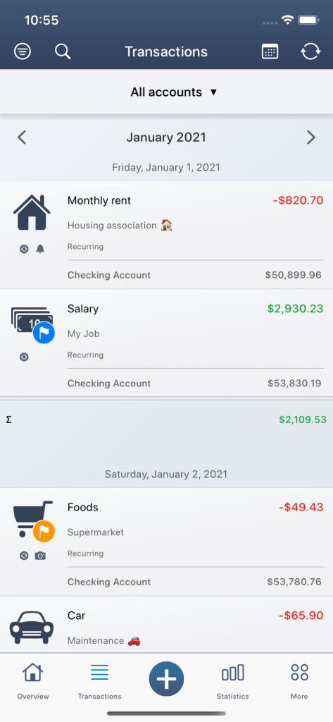
By default, the periods are displayed monthly. You can change this mode at the top left of the filter criteria to display the transactions quarterly or annually. You can also change the sorting (e.g. by date, by amount or by category) or choose an ascending or descending order. At the top of the filter there is the possibility to switch between different views. In the standard view, the transactions are displayed normally, with a title, a date and a sender or recipient. The extended view, on the other hand, shows further details such as the current account balance for each transaction and further comments.
Hint: If you switch to the “Extended view” at the top left of the filter, further details on each transaction will be visible, such as the current account balance for each transaction. It is recommended to sort by date, so that the current account balance make sense.
Click on a transaction to open the edit menu. With the symbol on the far right, you can edit the transaction. With the second symbol from the right, you can copy the transaction. The third symbol from the right shows all details of the transaction. Alternatively, you can hold down a transaction for longer to activate this menu. The transaction is deleted with the symbol on the far left.
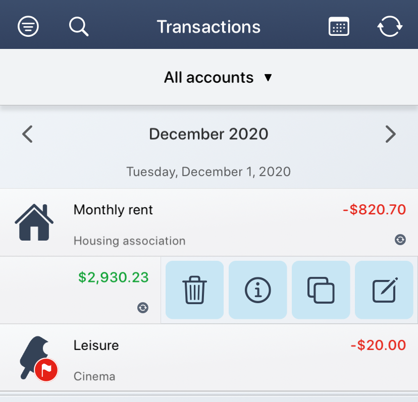
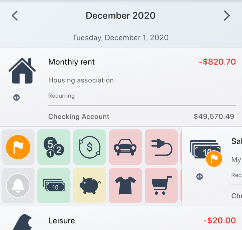
To open the special functions of the transaction, you have to click on the category icon on the far left (if the transaction has not yet been categorized, the category icon is an empty rectangle). In this menu you can assign a new category to the transaction without changing to the edit view. In addition, you have the option of marking the transaction with a colored flag or adding a due date (the symbols on the far left).
Hint: If you have opened the special functions and hold the flag symbol longer, you can change the flag color without changing to the edit view. Otherwise the last used flag color is set by default.
At the top left of the magnifying glass icon you can search for certain transactions and apply further filters such as the period or the category. You can also set the flag marker just mentioned as another filter criterion. This way you can quickly find what you are looking for and only the specified elements are listed in the transaction view!
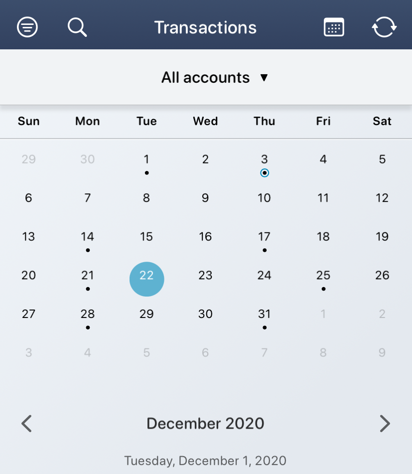
The transaction view is open, but what’s the quickest way to get to today? You can do this by clicking on the calendar in the top right corner. If the monthly mode is active, the individual days of the calendar month are shown here. If you have already created a transaction for today (recognizable by a small dot below the day), you can simply click on the corresponding day (here April 3, 2020, marked by the blue background) and you will automatically become scrolled to today’s row. If you click on a day where no transaction has yet been created, the window for a new transaction with the preset day opens directly. In this way, you can directly create transactions for a specific day.
Hint: If you click on April 23, 2020 in the calendar, for example, you will be directed to the existing transaction. The app remembers the previously selected date for the next 10 seconds. If you click on the plus symbol at the bottom in the middle during this time and create a new transaction, this date – i.e. April 23, 2020 – will be preset.
All recurring transactions are not only listed in the transaction view, but are also summarized in a separate view. You can find this list of all recurring transactions at the top right by the circular arrow symbols.
Statistics
In the statistics view you can generate various evaluations. The more detailed your transactions are categorized, the better and more accurate the data can be evaluated. The filter at the top left plays a major role. Here you can choose between the three basic modes at the top: “Profit and loss”, “Forecast” and “Manual mode”.
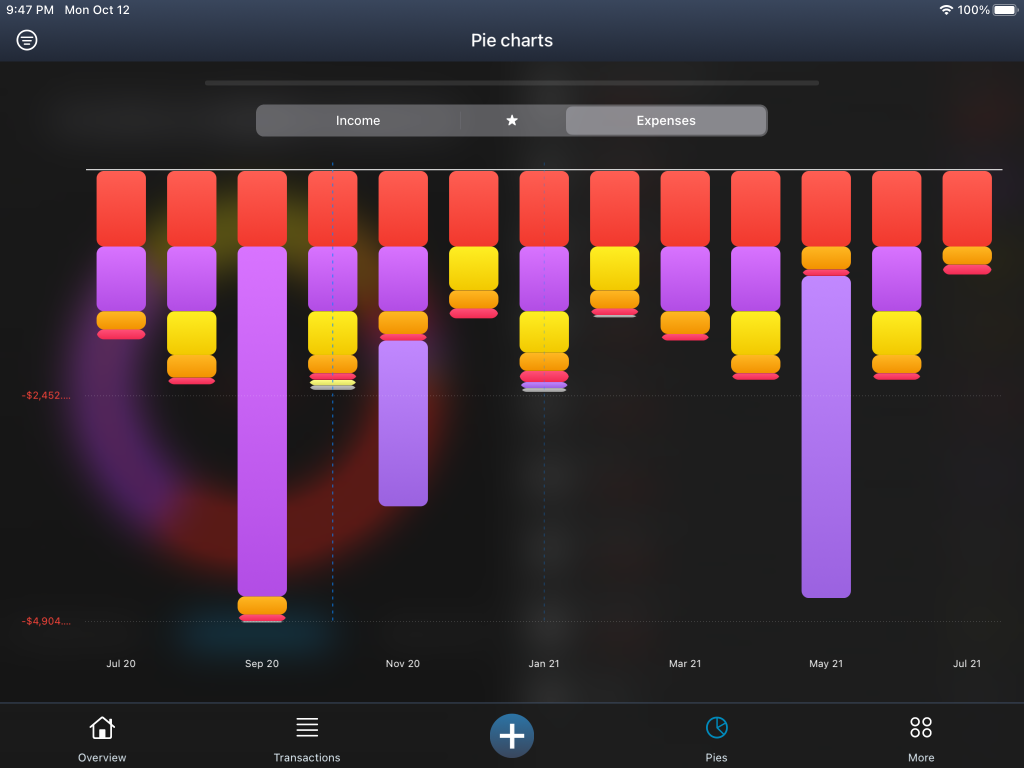
The current status of your income and expenses is evaluated in the “Profit and loss” mode. Your income and expenses are evaluated in a bar chart and you can see immediately in which period you made profit or loss.
Hint: If you swipe to the left or right within the bar chart in the mode “Profit and loss”, the displayed months will shift backwards or forwards.
All evaluated bars are also listed below the diagram (on iPad on the left). To see which individual income and expenses add up in a bar, you can simply click on the period value in the list. A transaction view of the corresponding period then opens.
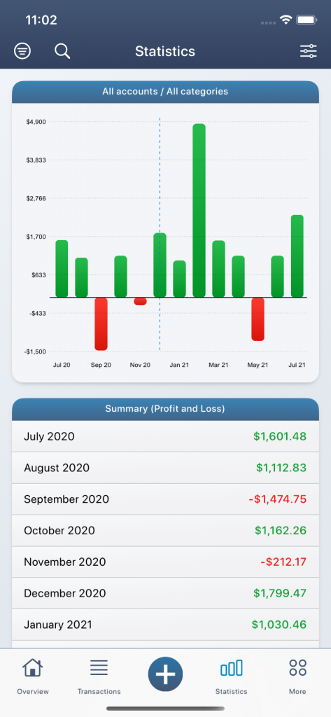
Below the summary, some basic evaluations are also generated, such as your average earnings per month or the biggest spend in the past month.
With the filter on the top left you can specify your evaluations. Here, for example, you have the option of evaluating only a specific account or only a specific category. Several filters can be activated at the same time. If a filter is active, the symbol at the top left is shown filled! To switch off all active filters, you can simply click on the filter in the top left and then click on “Reset filter” below the menu.
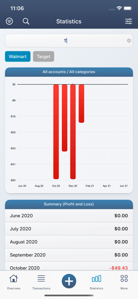
But this is far from over! In addition to the selected filter settings, hashtags (subcategories) or other keywords (e.g. title, recipient / sender or comments) can be evaluated in the text field at the top left of the magnifying glass symbol. Depending on the letter entered, suitable hashtags appear below the text field and can optionally be activated. Of course, several hashtags can also be activated at the same time. The evaluations in the diagrams then automatically adapt to the newly set filter criteria.
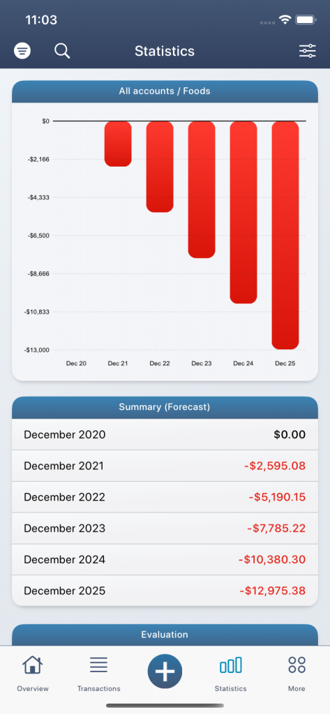
In the “Forecast” mode, your average profit or loss is determined using the selected filter criteria and extrapolated to the future months and years. For example, if you activate the “Salary” category, your average salary will be calculated as a monthly profit. Then you can see in the diagrams how much salary you are likely to earn in the next months or years.
Hint: With the advanced settings (under More / Settings / Advanced Settings) you can also activate a trend line or change the calculation mode of the forecast values.
The “manual” mode is automatically activated as soon as you define your own period in the top right or generate a cumulative view. In the manual view, the values are evaluated in a line diagram. The green line represents the actual course and the purple line the theoretical course. The legend for the colors can be found below the menus.
Pie charts
In the pie charts, your main categories are shown as a percentage in different circle sectors. So here you can see very quickly what a certain category’s share of your total expenditure or income is in a certain period. In order not to distort the graphic with a mixture of income and expenditure, there is a separate pie chart for income and expenditure. You can change the mode above the pie chart.
All colored sectors can be found in the pie chart and can also be clicked on. In the center of the pie chart, the sum changes according to the active circle sector. The individual categories can also be found below the pie chart. If you click on a single category, the editing menu opens. On the far right you can open the transaction view for the selected category. You will see a list of the individual transactions that make up the sum. You can open the statistics with the second symbol from the right. Here you not only change the view, but also certain filter criteria are set automatically. For example, if you click on the “Clothing” category and then on the second icon in the editing menu from the right, you automatically activate the “Clothing” category in the statistics view at the top left under the filter criteria. The evaluations therefore only represent the “Clothing” category.
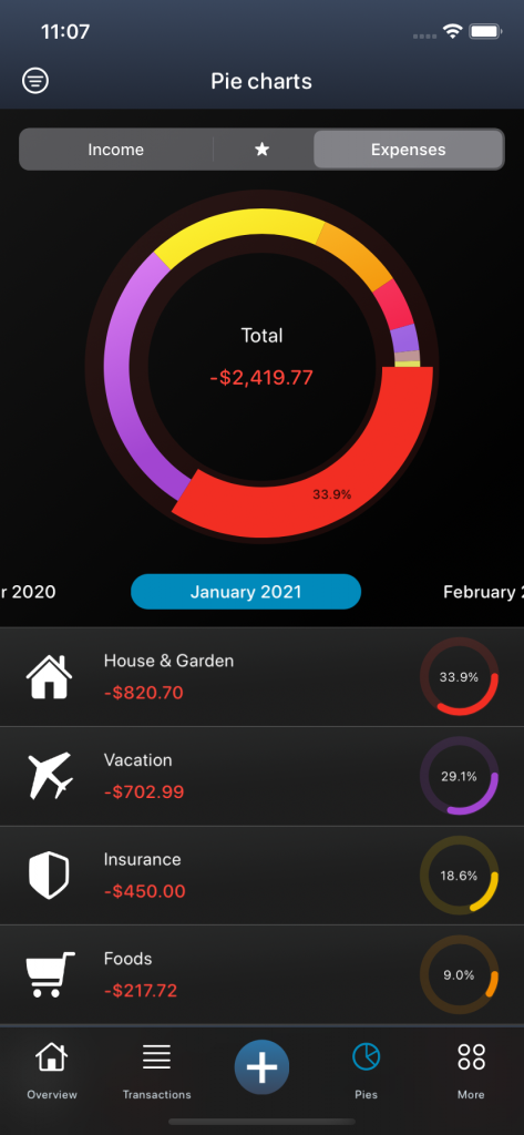
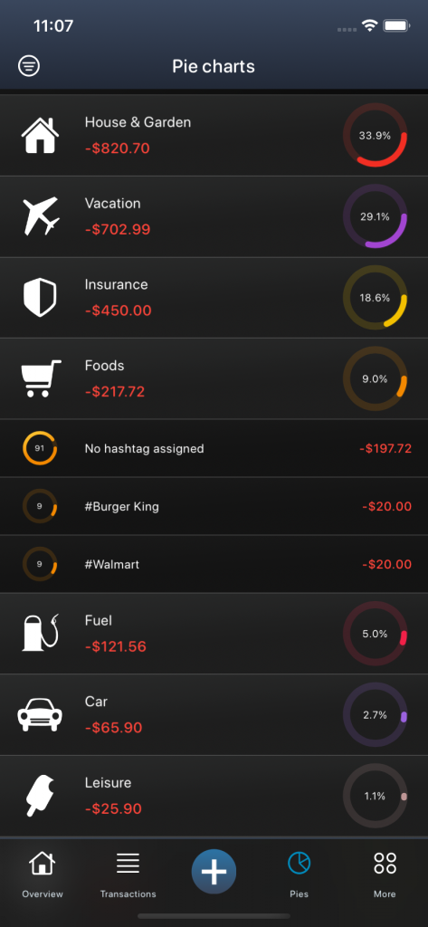
If you have assigned additional hashtags (subcategories) to a certain category, you can use the third symbol from the right to evaluate the individual hashtags (see #Walmart, #Aldi, #Supermarket, etc.).
With the filter at the top left, you can specify your evaluation analogous to the previous chapters and, for example, only evaluate a certain account or adjust the timeline.
Finally, there is also the possibility to evaluate the income and expenditure together in one diagram. To do this, click on the star in the top center. Here you can see your incomes in relation to your expenses.
Goals
You can use the goals to track and manage your financial savings goals. For example, if you want to go on a long-awaited journey or are you dreaming of a new car, put some of your income aside and invest the money in your savings goal!
There are two basic options:
- Automatic mode: In this mode, your income and expenses are used to automatically calculate when you will likely reach your savings goal.
- Manual mode: In this mode, you can manage your savings goal manually according to your needs and define your own timeframe.
To create a new savings goal, click on the plus symbol at the top right under “More / Goals”. The editing menu for the savings goal then opens.
No further action is required in automatic mode. All you have to do is define a title and an amount that you want to save and, based on your income and expenses, it is automatically calculated when you will likely reach your savings goal. If you also set an account for the savings target, the forecast calculations will only be carried out on the basis of the selected account. With this mode you can see at a glance when you will reach your goal without having to pay into it manually.
With the help of the manual mode, however, you can manage and evaluate your savings goal individually. In addition to the title and the amount, you also specify the timeframe by when you want to achieve your savings goal. Based on your entries, you can see how much money you have to put aside per month in order to reach your savings goal. Your manual goal is firmly linked to a specific account. If you choose “New Account”, however, a new savings account will be created for your goal. The balance on this linked savings account is the basis for calculating your savings goal. There are two ways to put money into your manual savings goal. Either you pay directly into the savings account by creating a new income or a new transfer. Or you can open the corresponding savings goal under “More / Goals” and deposit an amount directly by clicking on “Deposit”. In the following menu you can then enter an amount and optionally choose an account from which the amount should be debited. In this case, a new transfer will be created. On the other hand, if you leave the account on “No account defined”, a new income is simply created in the savings account.
Budgets
In the budget view all your financial goals (budget goals) and limits (budget limits) are listed. In this way, you keep an eye on both your income and your expenses and save money.
- You can create budget goals for your income categories. So you give yourself an amount that you want to generate according to plan.
- You can set budget limits for your expense categories. So you set yourself a financial limit and try to adhere to it.
To switch between these two modes, you can choose between income and expenses at the top center (on the iPad, top left). To create a new budget, you have to click on the little plus in the top right or edit an existing category by clicking on a category below the pie chart (on the iPad on the right) and editing it (symbol on the far right).
You can find out more about creating budgets in the chapter: Core functions.
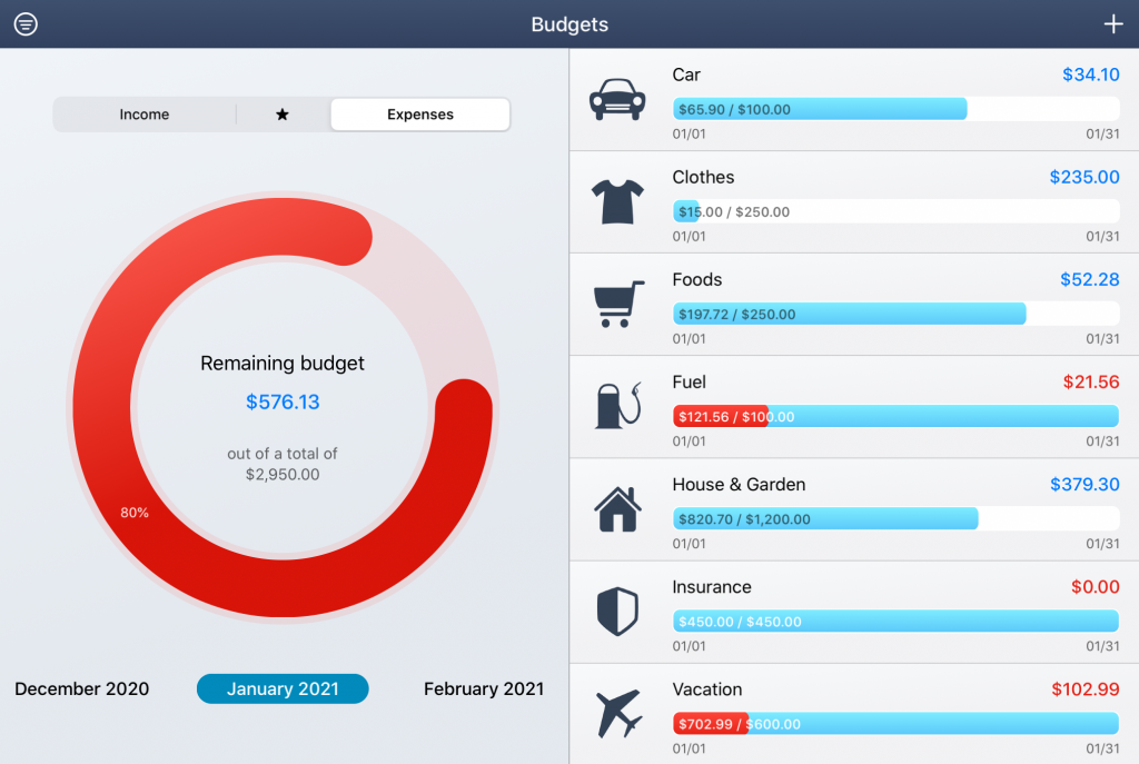
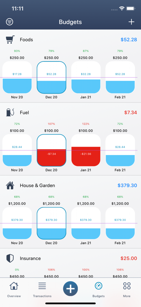
In the large pie chart you can immediately see how much budget you still have in total for your expenses (active mode: expenses) or how much income you still have to generate in order to achieve your budget goal (active mode: income). All individual budgets can be found below the pie chart (or on the iPad to the right). The bar chart shows how much budget you have left for each category. As shown in the screenshot above, you have already spent USD 100.00 on the total budgeted USD 250.00 in April for the expenditure category “Clothes”. That leaves you with USD 150.00 for the rest of the month. If you have exceeded your budget limit, as here shown in the “Vacation” category, the bar turns red. The amount of the remaining or exceeded budget is shown on the right above the bar. To get more information about the budgets, you can hold down the budget category or alternatively click on the info symbol in the edit menu. All categories that have not yet been budgeted can be found below the budgeted categories.
Hint: Within the advanced settings you can also change the calculation mode for your budgets. By default, the budget is only calculated for budgeted categories. You can find the active mode below the budget categories.
In order to make the different budgets comparable, they are broken down to one budget per day. Therefore, the amount of the budget depends on the selected period and the budget interval. For example, if you create a budget for the interval April 15 to May 15 of USD 500, you will only have approximately half of it available in April and the other half in May. Similar to the other views at MoneyStats, you can change the period in the top left of the filter settings to switch to a monthly, quarterly or annual mode.
In addition, there is also a “total interval” as an option. This view shows the budget for the entire period. If your budget of USD 100 per month is defined from 01/01/2020 to 31/12/2022, then this entire period will be evaluated. It will be shown an available budget of USD 2,400.
Preview: The “Current period” mode will be added in the coming updates. If, for example, you have defined different time intervals for your budgets, for example a budget for car insurance every year and a budget for leisure activities every 2 months, the active budget will be displayed depending on the current day. The individual budget values are therefore not brought to a common denominator.
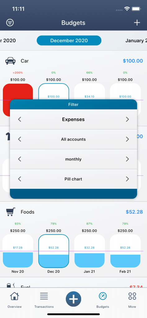
In addition to the normal bar view, there is also a pill chart as an alternative view. Here you can see several periods at a glance, so that you can better react proactively to financial bottlenecks.
Comparisons
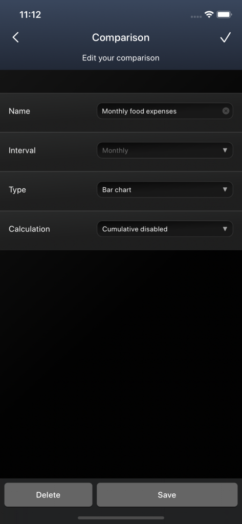
As the title suggests, you can use the comparison view to compare different values and trends in your finances. Combine categories at different times or compare your income and expenses. Depending on the settings, you can compile various data and have it evaluated as a diagram.
With a click on the plus in the top right you create a new comparison. You first assign a name and then define the boundary conditions of your comparison:
- Monthly, Quarterly, Yearly: The interval at which you want to compare your transactions.
- Bar chart, line chart: The type of chart how your comparison should be displayed.
- Cumulatively activated / deactivated: If the cumulative mode is activated, an additive increase takes place with each additional value.
In this example, you create a new comparison for your annual commercial income, evaluated as a bar chart. Initially, only one superordinate section is created. You can then add further subsections to this main section, which are then evaluated as bars in your diagram.
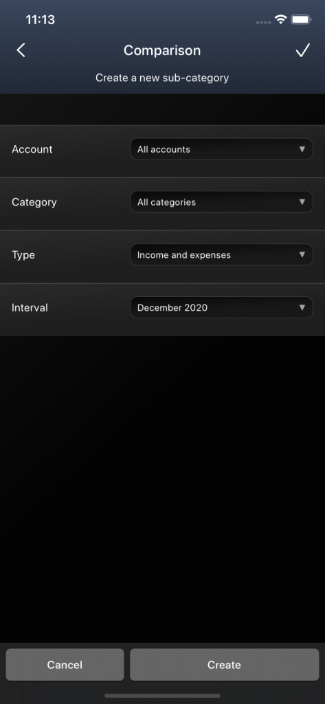
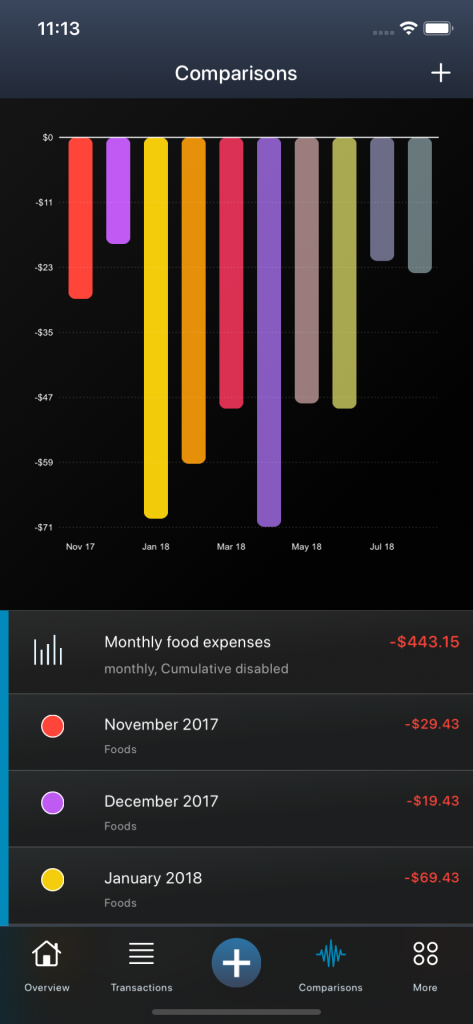
To create a new subsection, you have to click on your previously created main section. In the editing menu you have to click on the second symbol from the right to add a new subsection. All parameters that you want to assign to your new subsection are now defined here and based on these values the subsection is added and evaluated as a new bar in your diagram. To include all transactions from all your accounts, select “All accounts”. Since we only want to consider the commercial income in this example, you now select the “Commercial” category so that only the transactions that are assigned to the “Commercial” category are evaluated. You can also specify whether you only want to sum the positive amounts or only the negative amounts by choosing only the income or only the expenditure values. I do not want to make any further specifications here and choose “Income and Expenses” instead. Finally, I choose the year that I would like to have evaluated for my subsection.
Hint: So that you don’t have to add all subsections manually, there are also certain templates when creating a first new subsection. If you choose, for example, the “Account comparison” or the “Category comparison”, subsections are automatically created for all your accounts or categories.
Similarly, you can add further subsections or additional years. Each subsection is then listed below the main section and each section can of course be edited. If you have created several main sections, only the subsections of the active main section are shown. To activate a new main section and evaluate it in the diagram at the top, you have to click on the main section and click on the left button in the editing menu. To edit a section or a subsection, you have to click on the icon on the far right. To delete a section, you must first edit it and then you can remove it using the button at the bottom left.
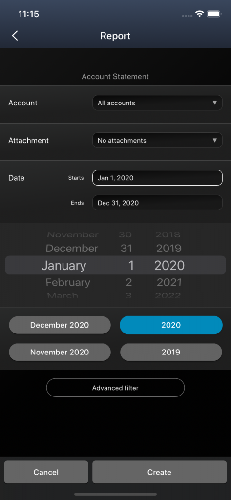
Reports
With the help of the reports you can generate detailed evaluations. The reports can be exported as a PDF file or shared with other programs or people. They are very good for getting a quick overview of your own finances.
Depending on the application, there are different types of reports. So far there are the following types of reports:
- Financial Report: An interim report on your finances and budget.
- Account statement: Summary of all your income and expenses including current account balances.
- Account development: Forecast the account balance in the coming months and years.
- Profit and loss: Sum of income and expenditure per category and period.
- Evaluation of Categories: Summary of the percentage distribution per category and period.
Depending on the report type, you can make various settings. With the report type “Account statement” you have, for example, the possibility to set a specific account. However, if you want to generate a bank statement of all your accounts, then you have to select “All accounts”. Finally, you have to determine the period at which the account statement is to be evaluated. For faster operation, there are also predefined periods below the date selection (e.g. April 2020 or 2020) that you can simply click. The start and end dates of your period will then be adjusted accordingly.
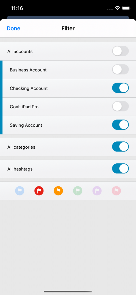
If these setting options are not enough for you and you want to define more precisely what should be evaluated in the account statement, you can also click on “Advanced filter“. There you have the opportunity to select multiple accounts, categories and hashtags or to activate certain flag markings.
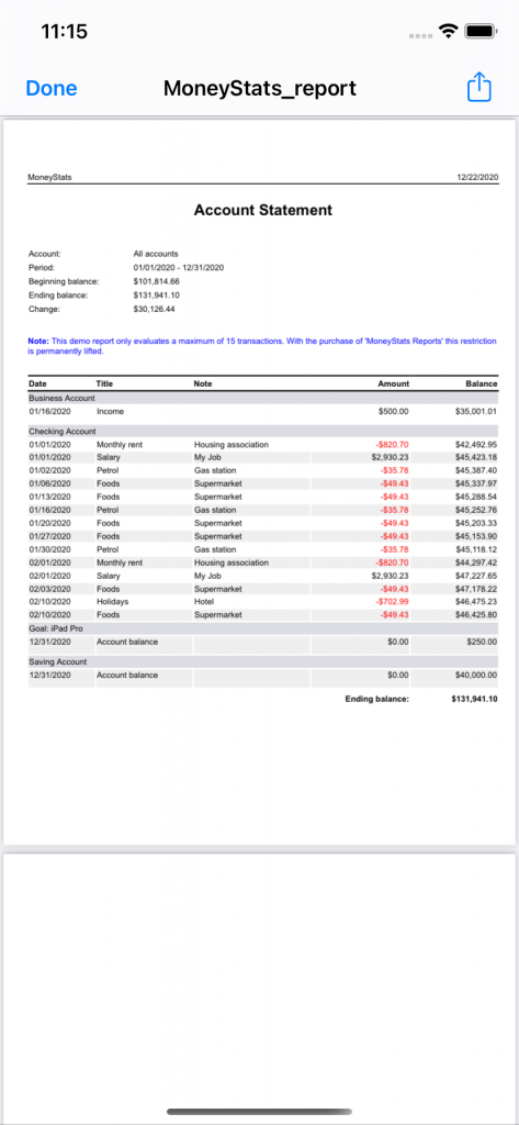
When you have created a new report, a web view of the report is first created (HTML file). To create a pdf file from this report, you have to click on the share icon in the top right. As soon as you have generated the pdf file, you can share the file with other programs or people or save it in your files.
Hint: Once the report has been created, you can zoom in and out using two fingers within the window.
But the report types also appear elsewhere, for example in the “Lists” and the “Overview”. Every new month there is a free financial report on the overview page. This evaluates the past month and can always be found at the top as a new post.
Lists
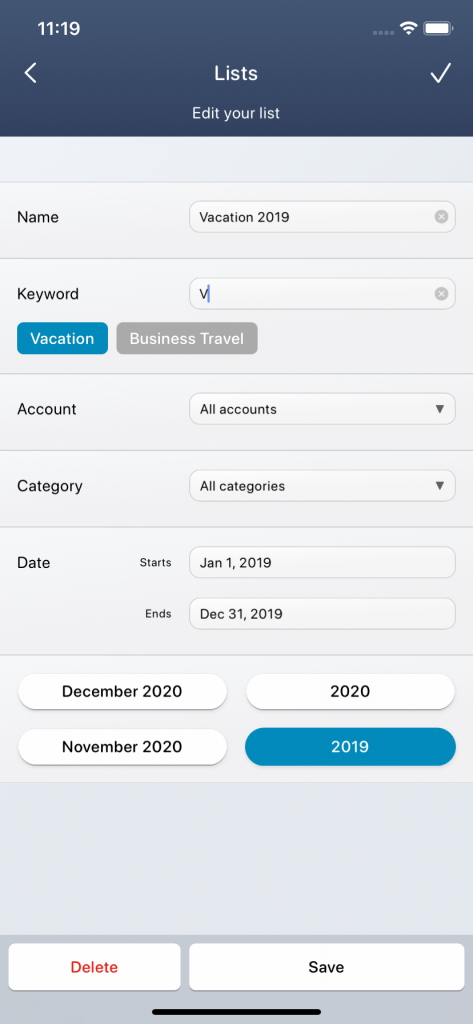
Using the lists, you can collect certain transactions based on filter criteria and have specially tailored reports generated.
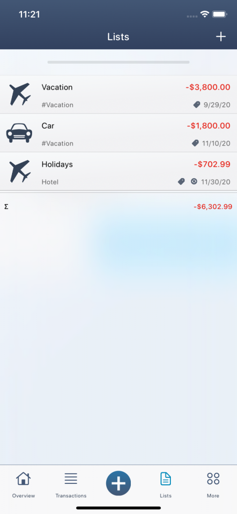
An application example is a list for the “Tax return 2020“. There you can define that you only want to have transactions with certain hashtags such as “advertising costs”, “comercial”, “craftsman”, etc. evaluated and that you only want to consider the “business account”. As soon as you create new income and expenses and label them with the corresponding hashtags, these are automatically added to the corresponding list and evaluated. At the end of the year, you can finally generate a report from your list and immediately see all your tax return transactions without having to search for them in your records.
Hint: To mark the transactions for your lists, you can use the hashtags. Since you can also activate hashtags of different categories for your transactions, it makes sense to create a dummy category for certain categorizations, for example the main category “People” with the subcategories (hashtags): “Man”, “Woman” and “Child”. If the man has now paid the gasoline costs, you can first click on the main category “People” and activate the hashtag “Man” and only then carry out the actual categorization by selecting the category “Gasoline”.
Another example of a list is “Holiday 2019“. If you want to create a financial report at the end of the holiday or want to know who spanked the most money, simply assign the hashtags “Holiday 2019” and “Child” to your list. All transactions with the hashtags “Vacation 2019” and “Child” will then be evaluated in your corresponding list.
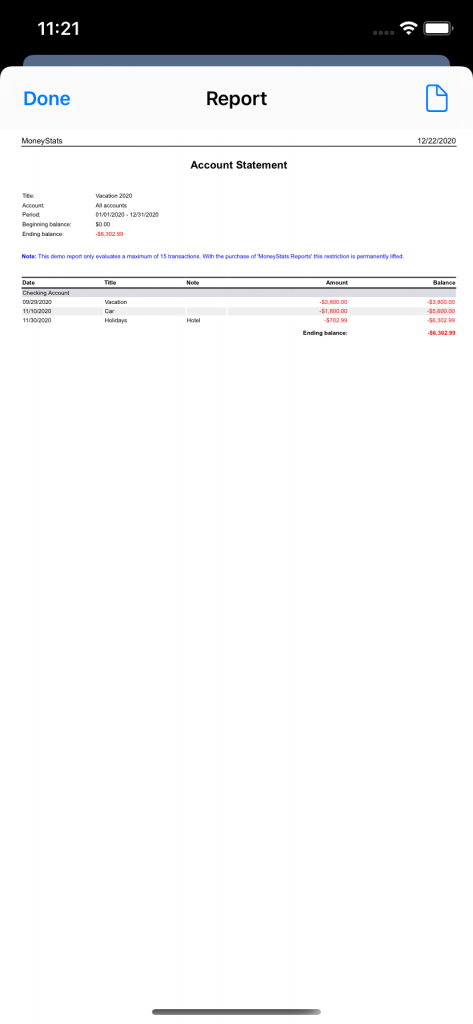
You can generate the following report types from your lists:
- Account statement: Summary of all your income and expenses including current account balances.
- Profit and loss: Sum of income and expenditure per category and period.
- Evaluation of Categories: Summary of the percentage distribution per category and period.
To create a new list, you have to click on the plus symbol in the top right corner. You can then define the filter criteria in the list and save them. In the list view you have the option of changing the sorting or clicking on a list element. In the edit menu you can edit the list (symbol on the far right), generate a report from the list (second symbol from the right), see all included transactions (third symbol from the right) or delete the list (symbol on the far left).
